Using Team Grid Layouts Widget
This documentation is based on the PRO version so additional features are PRO features.
Step 1: How to Add Widget:
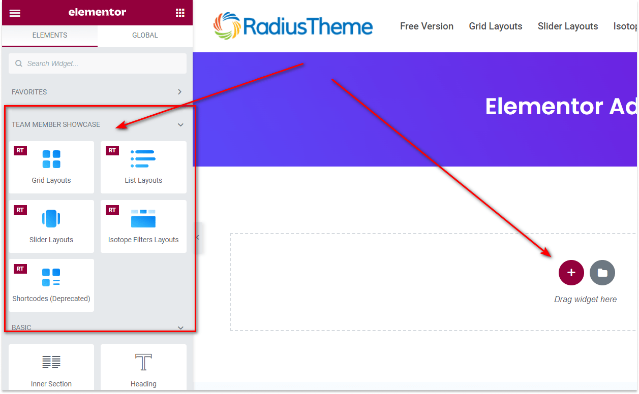
To use this Team Elementor Addon element, find the ‘Grid Layouts‘ element from the ‘ELEMENTS‘ tab (or from the top search field). Simply just Drag & Drop the ‘Grid Layouts’ into the ‘Drag widget here‘ or the ‘+’ section.
Step 2: How to Customize the Layout Settings:
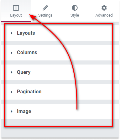
Under the ‘Layout’ tab, you will be able to select various layouts and customize the team’s visual looks. Please check below.
2.1: Layouts:
From the Layout Settings, you can choose your preferred layout.
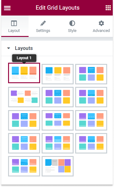
There are 14 predefined beautiful grid layouts.
The first two layouts are provided in the Free version, and the rest of the layouts are featured in the Pro version.
2.2: Columns:
From the Columns Settings, you can control the responsive columns, grid style, and grid content alignment

Number of Columns You can define the number of columns to display team members. It is a responsive
control, so you can define columns on Desktop, Tablet, or mobile devices.
Grid Style Pro You can switch between even or masonry grid layouts.
Alignment Pro You can control the text alignment for the grid content. It
is also a responsive control.
2.3: Query:
From the Query Settings, you can customize the query-related parameters that can include, exclude, limit and sort the team posts.
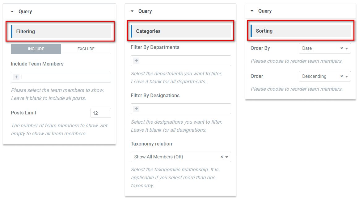
Filtering In this section, you can include/exclude or limit your team member posts. Categories You can also filter the team member posts using Departments & Designations Pro. Also, you can define the taxonomy relations. Sorting Use these settings to sort your team posts by Menu Order / Name / ID / Date or Random in Ascending or Descending order.
2.4: Pagination:
From the Pagination Settings, you can choose whether you need to show the pagination for team member grids. It is helpful if you have lots of team members.
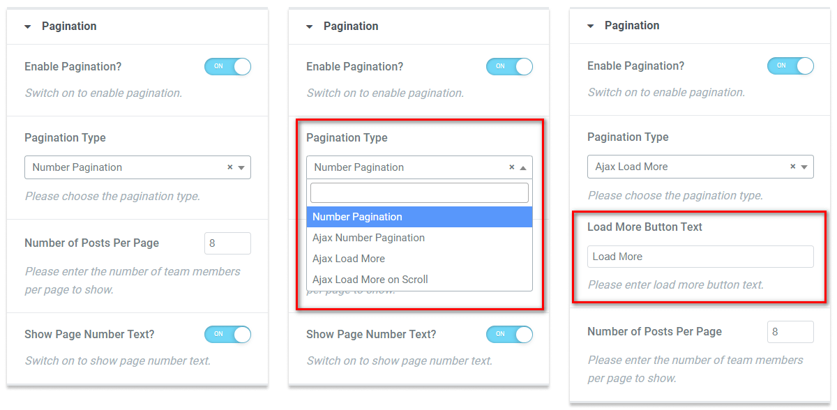
Enable Pagination You can enable the pagination from here.
Pagination Type You can choose the type of pagination. There are four types of pagination to choose from:
- Number Pagination Free
- Ajax Number Pagination Pro
- Ajax Load More Button Pro
- Ajax Load More on Scroll Pro
Number of Posts Per Page You can define the number of team members to display in each page from here.
Show Page Number Text You can show the page number (Only applicable for ‘Number Pagination’ ).
Load More Button Text Pro The button text for the ‘Load More’ button (Only applicable for ‘Ajax Load More’).
2.5: Image:
From the Image Settings, you can customize the image size of the headshot images of the team members.
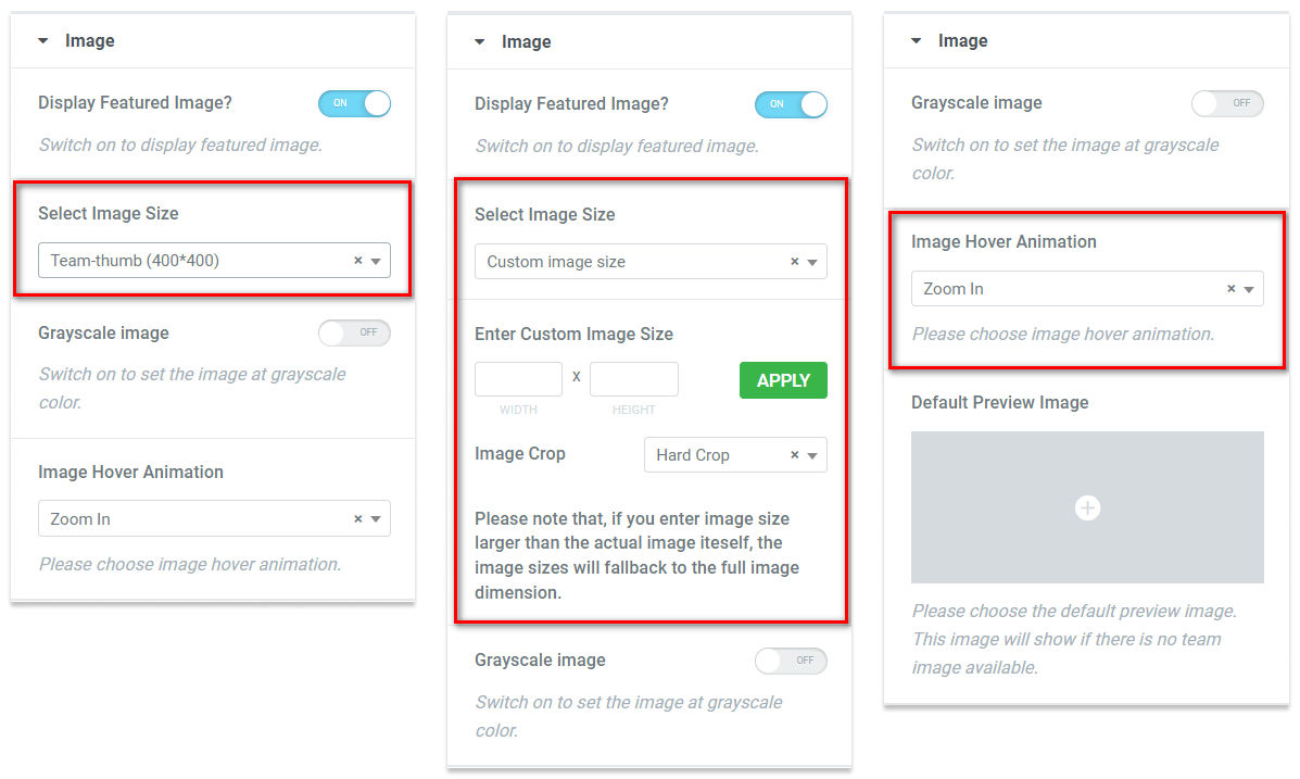
Display Featured Image You can enable/disable the featured image from here. Select Image Size You can change the image size of the team images. Custom Image Size If you want to add your own image size, you can choose the ‘Custom Image Size’ Option. If you select the custom image size,you will need to add the custom width and height of the image, as well as the image crop settings. Please note that, if you enter an image size larger than the actual image itself, the image sizes will fall back to the full image dimension. Grayscale image Pro You can enable/disable the grayscale-colored image from here. Image Hover Animation Pro You can choose the image hover animation. There are three options: Zoom In, Zoom Out, and None. Default Preview Image Pro You can change the default preview image. The default preview image will show if there is no featured image. You can also choose an SVG image here.
Step 3: How to Configure the Content Settings:
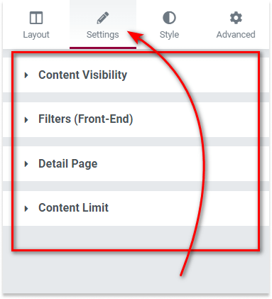
Under the ‘Settings’ tab, you will be able to select & configure various settings for content. Please check below.
3.1: Content Visibility:
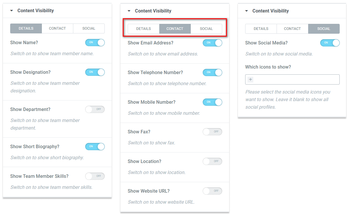
From the Content Visibility settings, you can show/hide different elements from the team member grids.
Details Tab:
Show Name Settings for show/hide team member Name.
Show Designation Settings for show/hide team member designation.
Show Department Settings for show/hide which department team member belongs to.
Show Short Biography Settings for show/hide short biography of the team members.
Show Team Member Skills Pro Settings for show/hide team member skills.
Contact Tab:
Show Email Settings for show/hide team member Email.
Show Telephone Number Settings for show/hide team member telephone numbers.
Show Mobile Number Settings for show/hide team member telephone numbers.
Show Fax Settings for show/hide team member Fax.Show Location Settings for show/hide team member location.Show Website URL Settings for show/hide team member website URL.
Social Tab:
Show Social Media Settings for show/hide team members’ social media information.
Which icons to show You can choose which social media information to be displayed. Please note that social media links need to update from the dashboard team member post.
3.2: Filters (Front-End) Pro :
Under the ‘Filters (Front-End)’ tab, you will be able to enable front-end ajax filters. Ajax front-end filters is a Pro feature. Please check below.
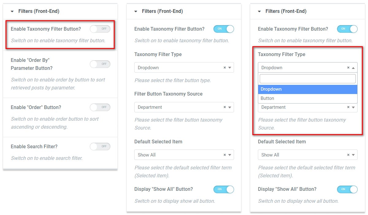
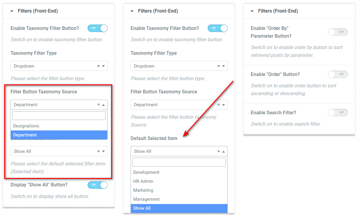
Enable Taxonomy Filter Button You can enable/disable the ajax filters from here.Taxonomy Filter Type You can choose the filter button type. There are two button types: Dropdown & Button.Filter Button Taxonomy Source You can select the taxonomy button source from here.Default Selected Item You can select the default selected button so that when the page loads, the button will be selected.Display “Show All” Button You can enable/disable the filter ‘Show All’ button from here.Enable “Order By” Parameter Button You can enable/disable the filter orderby button from here.Enable “Order” Parameter Button You can enable/disable the filter order button from here.Enable Search Filter You can enable/disable the search field. It will be helpful to find the team member with ease.
3.3: Detail Page:
From the Detail Page settings, you can configure how the users will access the team details page.
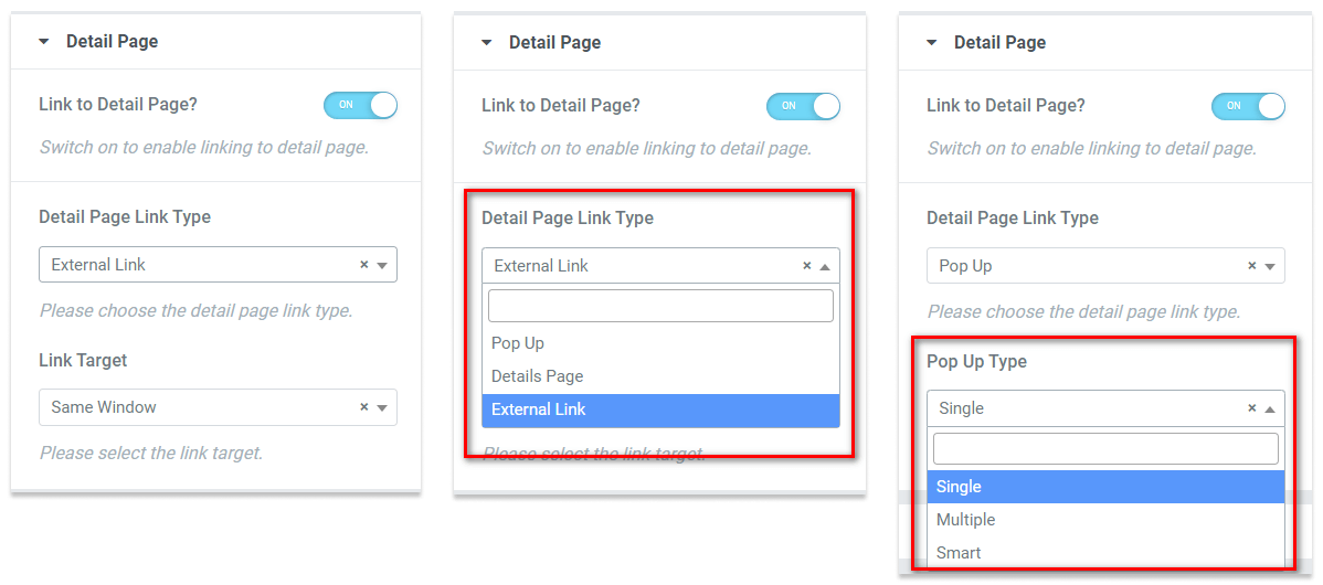
Link to Detail Page You can enable/disable the details page access link. Detail Page Link Type Pro You can choose the detail page link type. There are three link types:
- Pop Up: Team details will display as a popup.
- Details Page: This will redirect to single Team details page.
- External Link: This will redirect to the external URL that is set in dashboard team post.
Link Target Pro You can choose if the link will open in new window. Pop Up Type Pro You can select the popup layout type. There are three types of layout: Single, Multiple & Smart. This is only applicable if Popup is selected.
3.4: Content Limit:
From the Content Limit Settings, you can limit/truncate the team texts. It is helpful to control the height of the team grids.
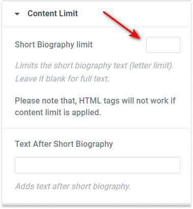
Short Biography limit You need to enter the number of letters you want to show in the short biography texts. Please note that this letter truncation will intelligently limit the texts and will not break any words.
Text After Short Biography You additionally can enable some text if you have a team details page (single team page) available.
Step 4: How to Style Team Grids:
Switch to the ‘Style’ tab to style all the features of Team Grids and get your desired result. Please check below.
Note: Some of the controls will be conditionally enabled.
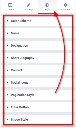
4.1: Color Scheme:
From the Colors Scheme Settings, you can change the primary colors & popup element colors to suit your needs.
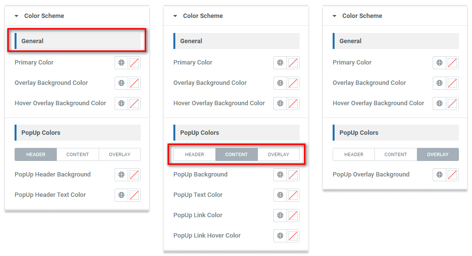
General Choose your primary color from here. These color settings are pretty self-explanatory. Please note that the ‘Overlay color’ settings will activate for some of the layouts.PopUp Colors Pro You can choose different popup colors for header and content texts, links, and also overlay colors.
4.2: Element Style Controls:
You can change the styles of each element in the Elementor Widget. These controls are pretty self-explanatory. Please check a sample screenshot below:
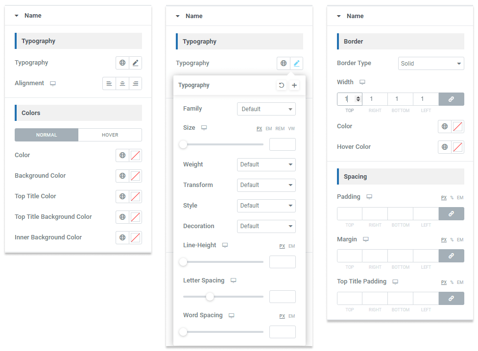
Below are the elements that include these common elements:
- Name
- Designation
- Department
- Short Bio
- Contact Pro
- Skills Pro
- Social Icons Pro
- Pagination Styles
- Filter Buttons Pro
You can change the typography, colors, borders & spacings of these elements easily. Please note that some controls will be conditionally enabled and some of them are Pro features.
4.3: Image Style:
From the Image Style Settings, you can customize the team featured images’ border and spacing.
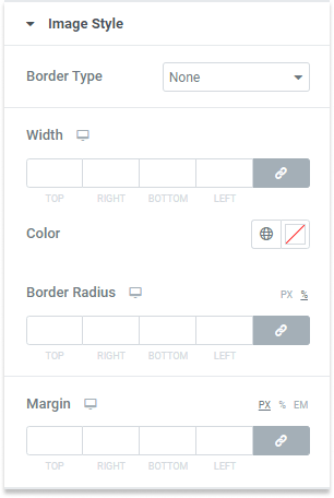
You can change the borders, border radius & spacings of these elements easily. Please note that some controls are Pro features.
4.4: Gutter Pro:
From the Gutter Settings, you can add elements & content gutters.
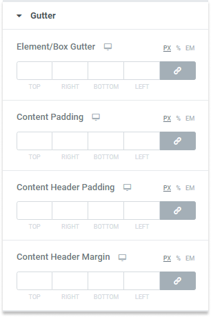
You can change the element & content spacings easily. Please note that some controls will be conditionally enabled.
