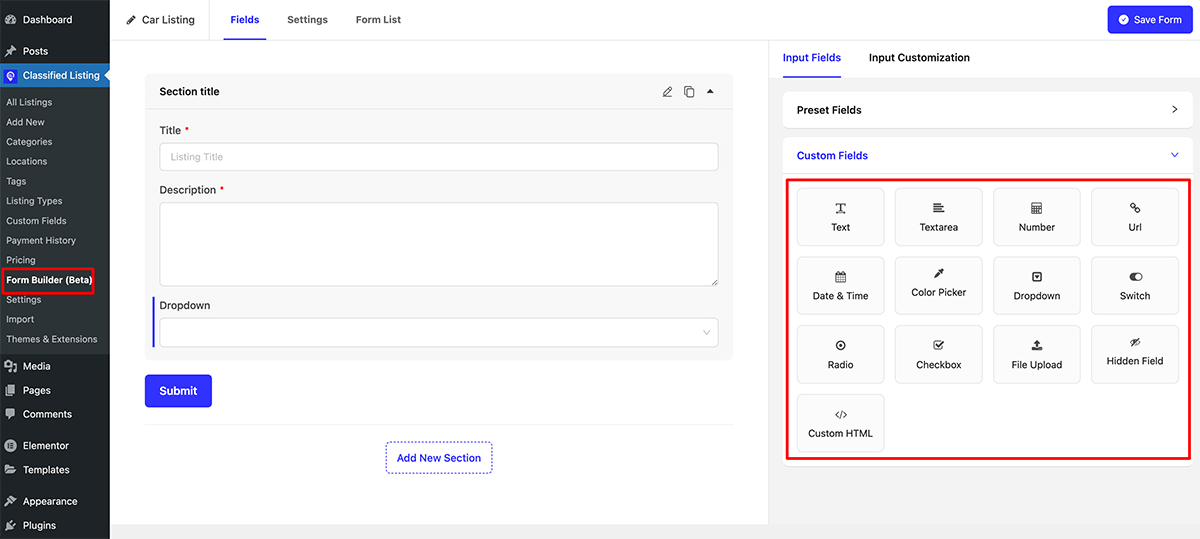
There are a total of 13 custom fields available now.
- Text Input Field
- Textarea Field
- Number Field
- URL Field
- Date & Time Field
- Color Picker Field
- Dropdown Field
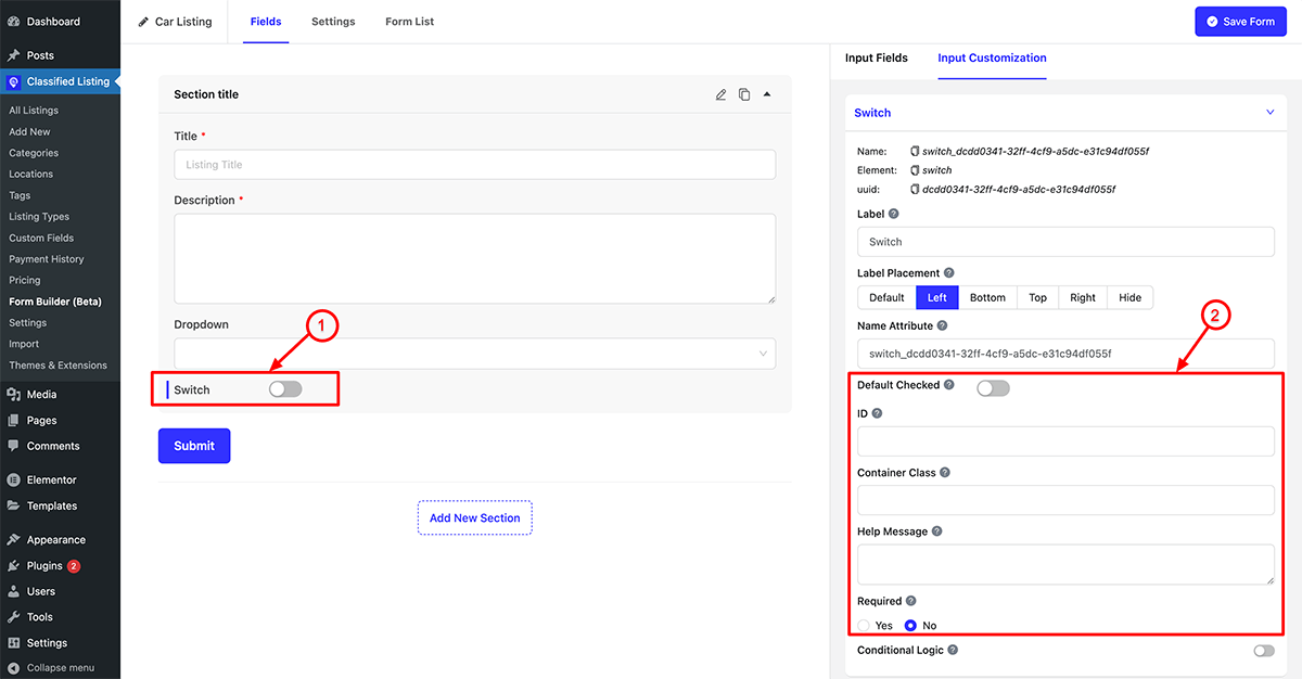
- Switch Field
- Radio Button Field
- Checkbox Field
- File Upload Field
- Hidden Field
- Custom HTML Field
Text Input Field
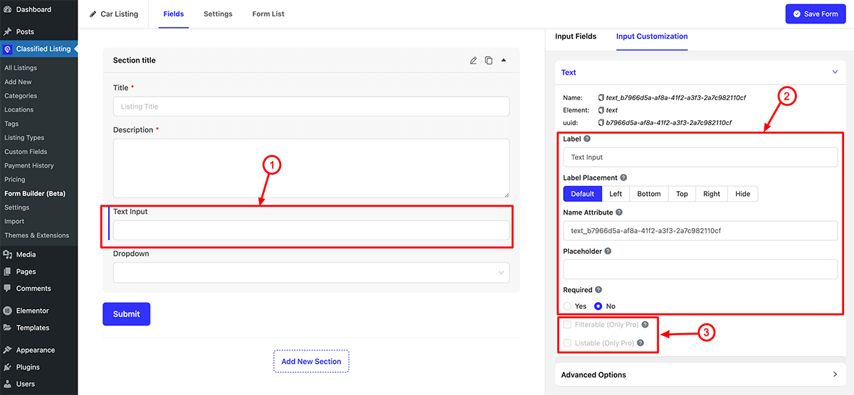
- Text Input: Drag the Text Input field into the fields container, then click the edit icon to customize its properties.
- Text Input Property: You can define the Label, Label Placement, Name attribute, Placeholder, and specify whether the field is Required or not.
- Filterable and listable: This is a Pro feature. If you enable “Filterable,” the field will be displayed in the sidebar filter. If you enable “Listable,” the field will be shown in the listing display.
Advanced Options:
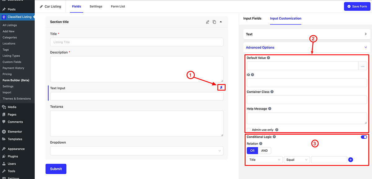
Each field has this property
- Conditional Sign: This symbol indicates that the field has conditional logic enabled.
- Advanced Option: Clicking on the dot (….) icon allows you to add the default dynamic value for this field, set a unique ID, container class, and help message. If you check “Admin use only,” this field will not be visible on the front end but will only appear in the admin end.
- Conditional Logic: A crucial setting for the field is conditional logic, allowing you to display or hide the field based on specific conditions.
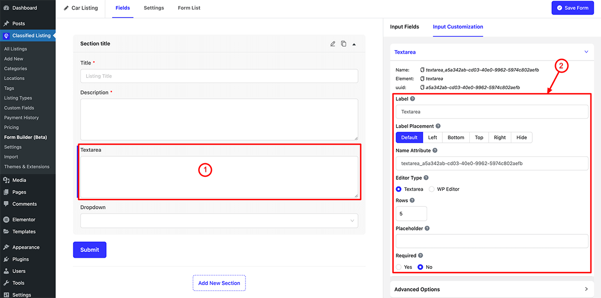
Textarea Field
- Textarea: Drag the Textarea Input field into the fields container, then click the edit icon to customize its properties.
- Textarea Property: You can define the Label, Label Placement, Name attribute, Editor Type (Textarea or WP Editor), Rows, Placeholder, and specify whether the field is Required or not.
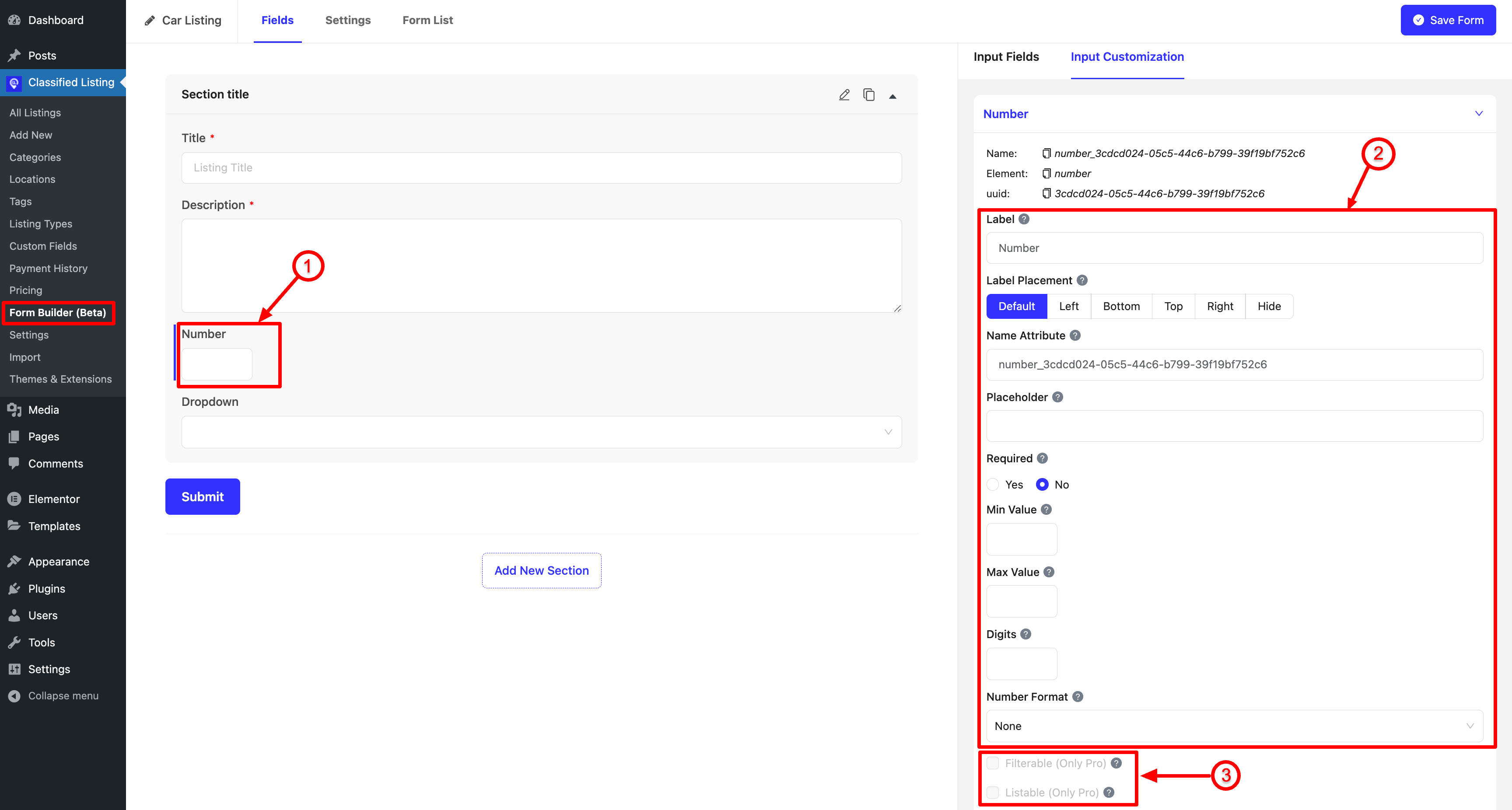
Number Field
- Number: Drag the Number Input field into the fields container, then click the edit icon to customize its properties.
- Number Property: You can define the Label, Label Placement, Name attribute, Placeholder, and specify whether the field is Required or not also min and max value, digits and number format.
- Filterable and listable: This is a Pro feature. If you enable “Filterable,” the field will be displayed in the sidebar filter. If you enable “Listable,” the field will be shown in the listing display.
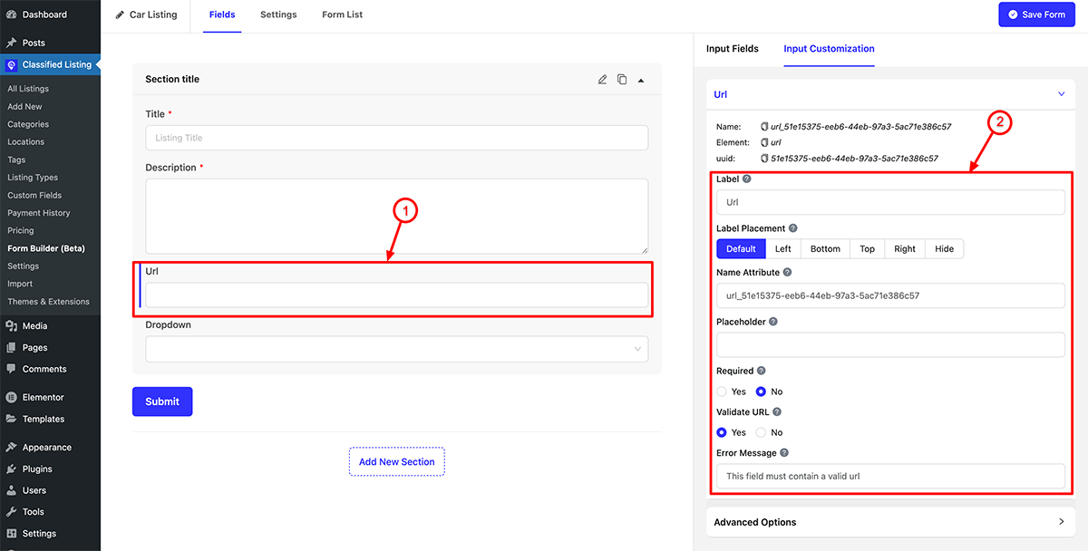
URL Field
- URL: Drag the URL Input field into the fields container, then click the edit icon to customize its properties.
- URL Property: You can define the Label, Label Placement, Name attribute, Placeholder, and specify whether the field is Required or not, Validate URL yes/ not also custom error message.
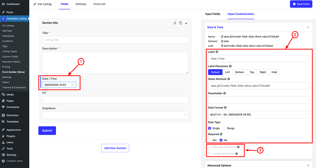
Date Field
- Date: Drag the Date Input field into the fields container, then click the edit icon to customize its properties.
- Date Property: You can define the Label, Label Placement, Name attribute, Placeholder, Date Format, Date Type (Single/ Range) and specify whether the field is Required or not.
Note: You can change the date to date range field by selecting Date Type Range. - Filterable and listable: This is a Pro feature. If you enable “Filterable,” the field will be displayed in the sidebar filter. If you enable “Listable,” the field will be shown in the listing display.
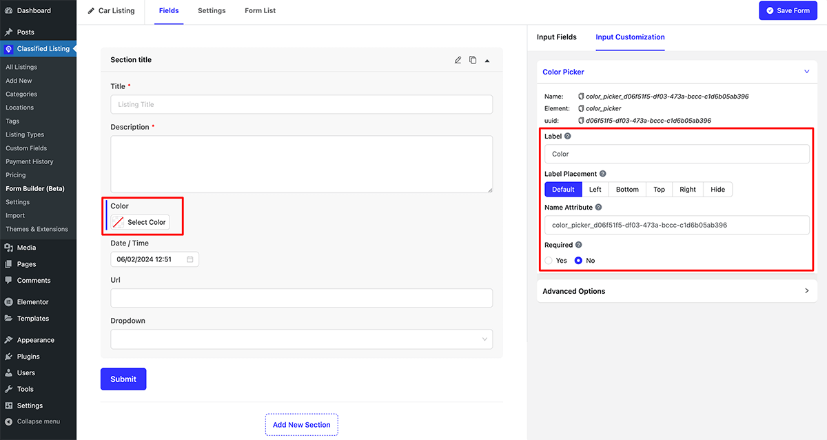
Color Picker
- Color: Drag the Color field into the fields container, then click the edit icon to customize its properties.
- Date Property: You can define the Label, Label Placement, Name attribute, and specify whether the field is Required or not.
- Filterable and listable: This is a Pro feature. If you enable “Filterable,” the field will be displayed in the sidebar filter. If you enable “Listable,” the field will be shown in the listing display.
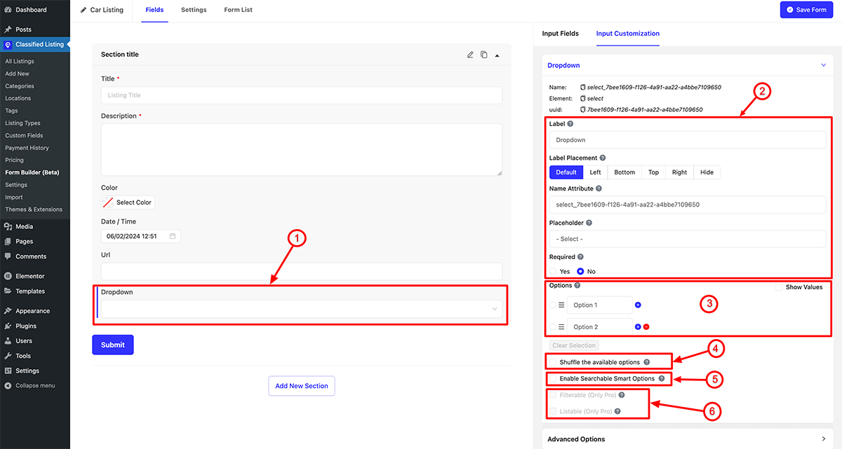
Dropdown Field
- Dropdown: Drag the Color field into the fields container, then click the edit icon to customize its properties.
- Dropdown Property: You can define the Label, Label Placement, Name attributes, and specify whether the field is Required or not.
- Dropdown Options: Clicking on the (+) icon allows you to add new options while clicking on the (-) icon removes an option. Additionally, clicking on “Show value” enables you to edit the option value.
- Shuffle available options:
- Enable Searchable Smart Option:
- Filterable and listable: This is a Pro feature. If you enable “Filterable,” the field will be displayed in the sidebar filter. If you enable “Listable,” the field will be shown in the listing display.
Custom Swatches
Swatches field noted the field value Yes or No. You can checked the field also make it required or not.
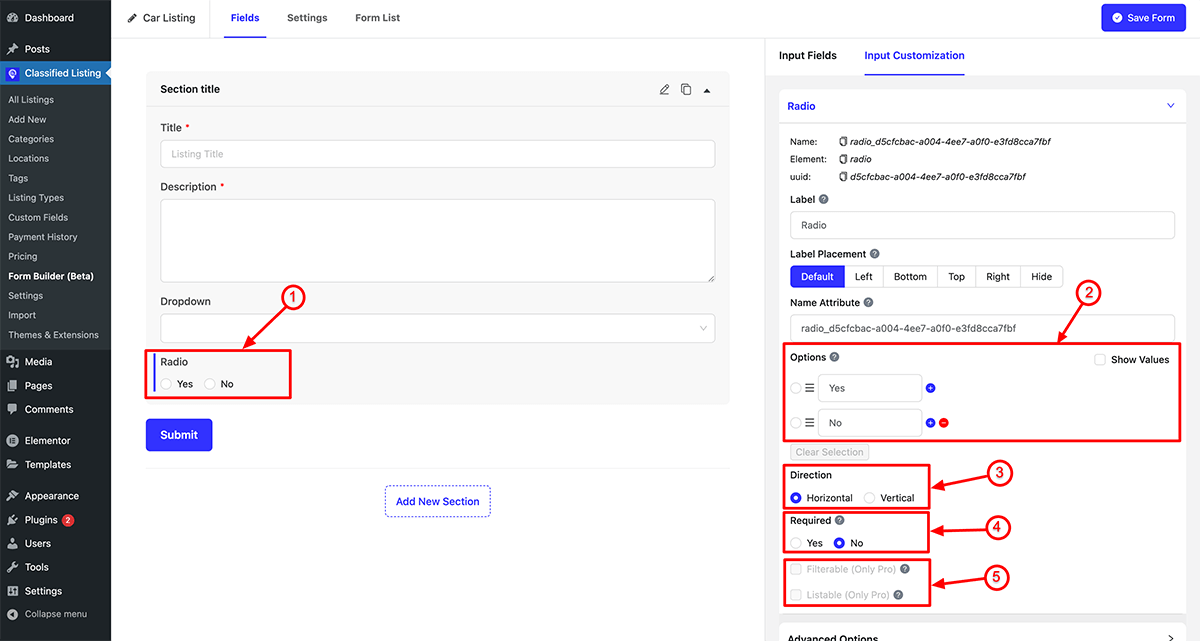
Radio Button
- Radio Button: Drag the Radio button field into the fields container, then click the edit icon to customize its properties.
- Radio Options: Clicking on the (+) icon allows you to add new options while clicking on the (-) icon removes an option. Additionally, clicking on “Show value” enables you to edit the option value.
- Direction: You can specify the option direction as either Horizontal or Vertical.
- Required: You have the option to make the field mandatory or optional.
- Filterable/ Listable Field: This is a Pro feature where this field can be displayed in the sidebar filter or in the list view.
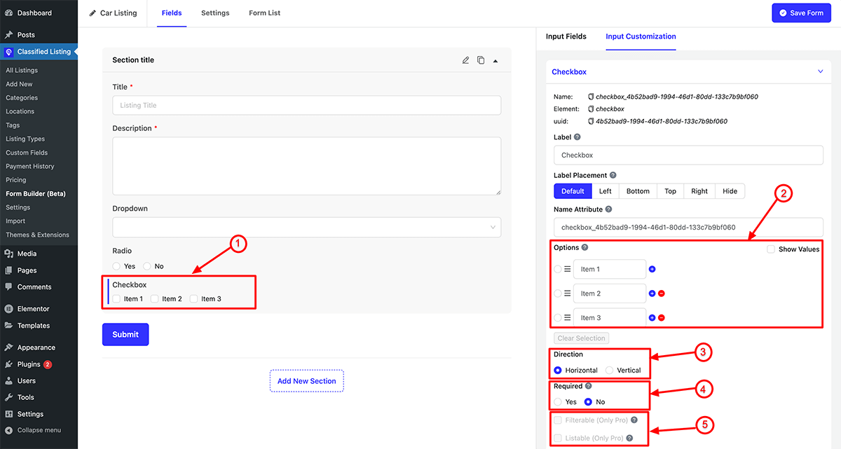
Checkbox
- Checkbox: Drag the Checkbox field into the fields container, then click the edit icon to customize its properties.
- Checkbox Options: Clicking on the (+) icon allows you to add new options while clicking on the (-) icon removes an option. Additionally, clicking on “Show value” enables you to edit the option value.
- Direction: You can specify the option direction as either Horizontal or Vertical.
- Required: You have the option to make the field mandatory or optional.
- Filterable/ Listable Field: This is a Pro feature where this field can be displayed in the sidebar filter or in the list view.
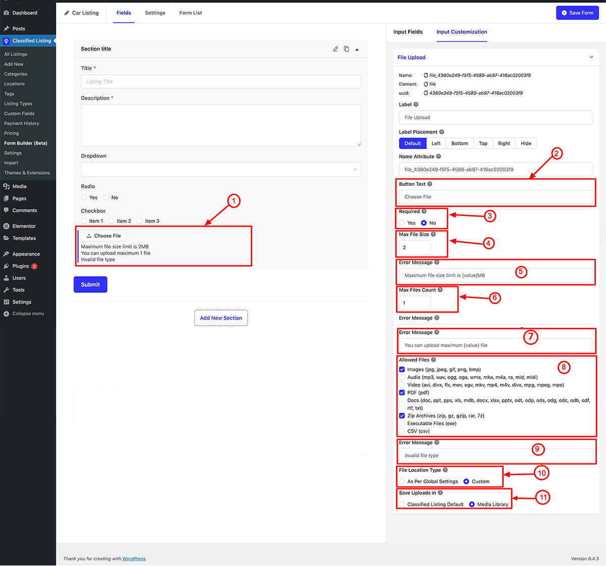
File Upload
- File Uploads: Drag the Uploads field into the fields container, then click the edit icon to customize its properties.
- Button Text: You can specify your own custom text for the button here..
- Required: You have the option to make the field mandatory or optional.
- Max File Size: Enter an integer value in megabytes (MB) for the maximum file upload size..
- Error Message: Input a customized error message for file size-related errors.
- Max Files Count: Specify the maximum number of files that can be uploaded.
- Error Message: Enter custom error message of max files count.
- Allowed Files: You can select the field extensions that are allowed for upload.
- Error Message: Please input a custom error message for the file type.
- File Location Type: You have the option to select the file location type from either Global Settings or Custom.
- Save Uploads In: You can choose the file location from either the Classified Listing default or the media library.
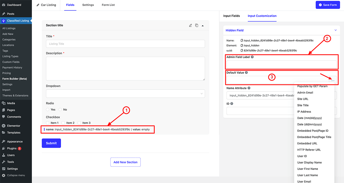
Hidden File
- Hidden File: Drag the Hidden File field into the fields container, then click the edit icon to customize its properties.
- Admin Label: Specify the admin label.
- Default Value: You have the option to designate a particular field value as a hidden field.
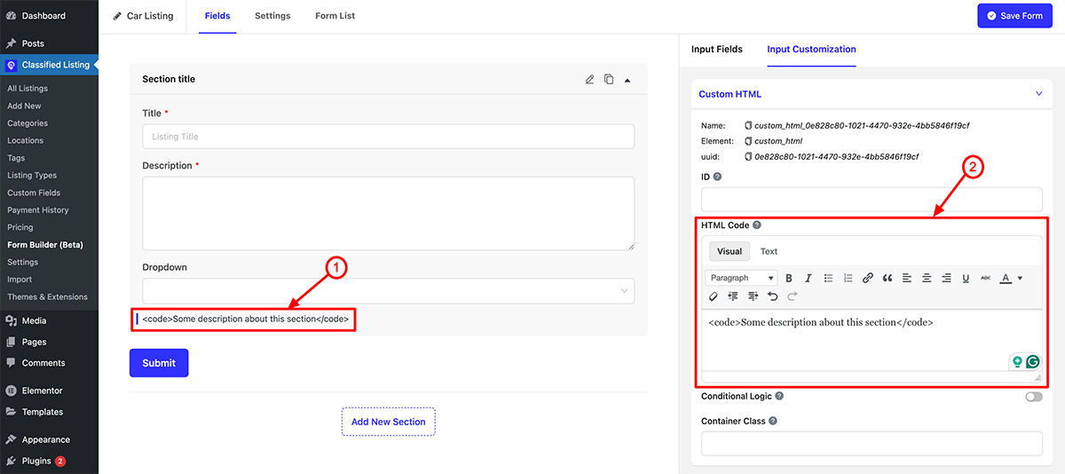
Custom HTML Field
- Custom HTML field: Drag the Custom HTML field into the fields container, then click the edit icon to customize its properties.
- HTML Code: You can include custom HTML code to be displayed on the front end.